Updated August 28, 2026 · 7 min read
By Boise Bath — bathroom & shower remodeling in Boise & the Treasure Valley
The short answer
For someone with low vision, contrast between surfaces matters more than raw brightness. Making the toilet, grab bars, shower threshold, and vanity edge visually distinct from the walls and floor behind them lets those elements be located and judged — which an all-white bathroom actively prevents, no matter how well lit.
Key takeaways
- Contrast sensitivity declines with age, so distinguishing similar tones becomes harder even when visual acuity is corrected.
- A monochrome bathroom — white fixtures, white walls, pale floor — removes the visual cues that indicate where surfaces begin and end.
- The highest-value contrast points are the toilet against the wall behind it, grab bars against their wall, and the floor against the wall at the perimeter.
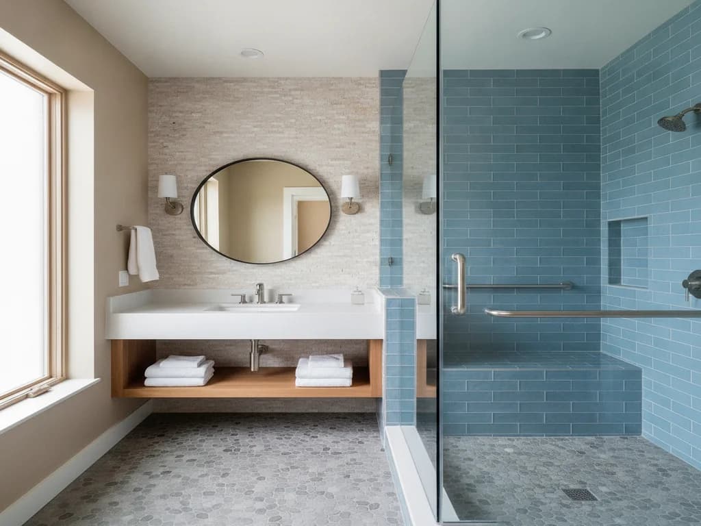
- Contrasting the shower floor or threshold from the surrounding floor helps a person judge where a transition occurs.
- Glare is the counterpart to contrast — highly polished surfaces and bare bulbs scatter light and can reduce visibility rather than improve it.
- Matte and honed finishes reduce glare and generally provide better slip resistance than polished ones.
- Contrast costs nothing: it is a selection decision, not an added product or a larger budget.
- These choices also help people with typical vision, particularly at night and during the adjustment from a dark bedroom.
Why brightness alone does not solve it
The instinct when someone struggles to see in a bathroom is to add light. That helps — aging eyes genuinely need more of it — but it addresses only half the problem, and past a point it can make things worse.
Contrast sensitivity is the ability to distinguish an object from its background when the two are similar in tone. It declines with age independently of acuity, which means someone whose glasses prescription is perfectly current can still have real difficulty telling where a white toilet ends and a white wall begins. Several eye conditions common in later life reduce it further.
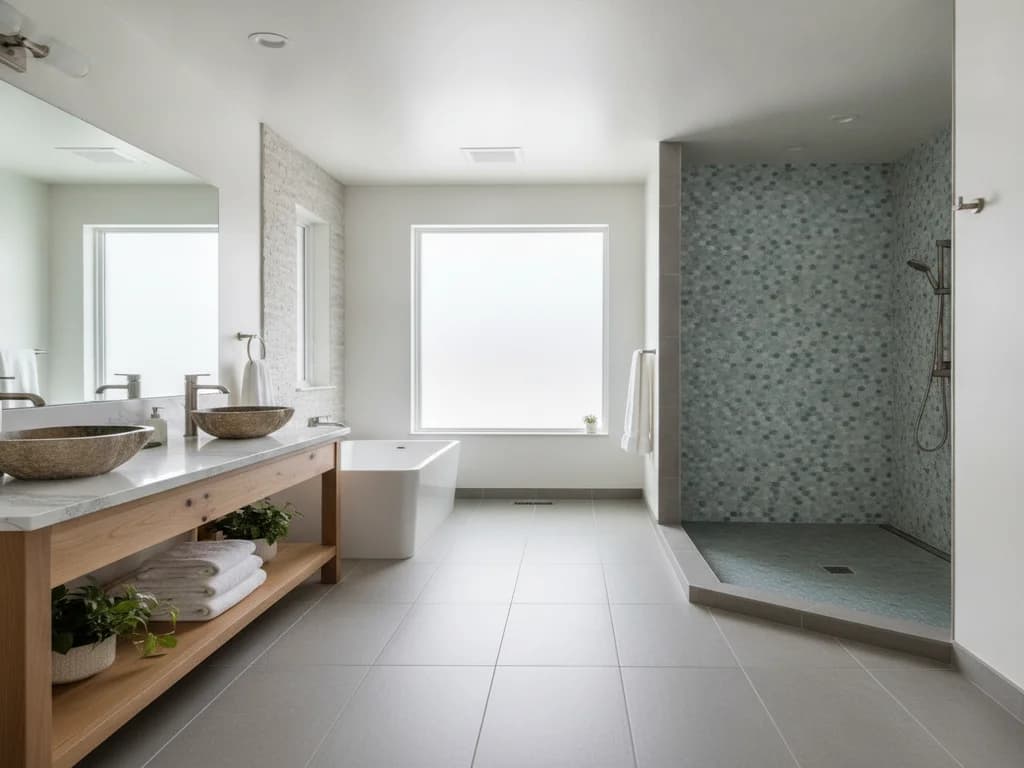
In a bathroom finished entirely in white and pale neutrals — a look that has dominated design for years — the room becomes a field of similar tones. The edges are still there; the visual information indicating where they are is not. Flooding that room with light does not restore the missing contrast, and if the surfaces are glossy, it introduces glare that makes matters worse.
Where contrast pays off most
A handful of specific relationships carry most of the benefit, and each involves making one element clearly distinct from what is directly behind or around it.
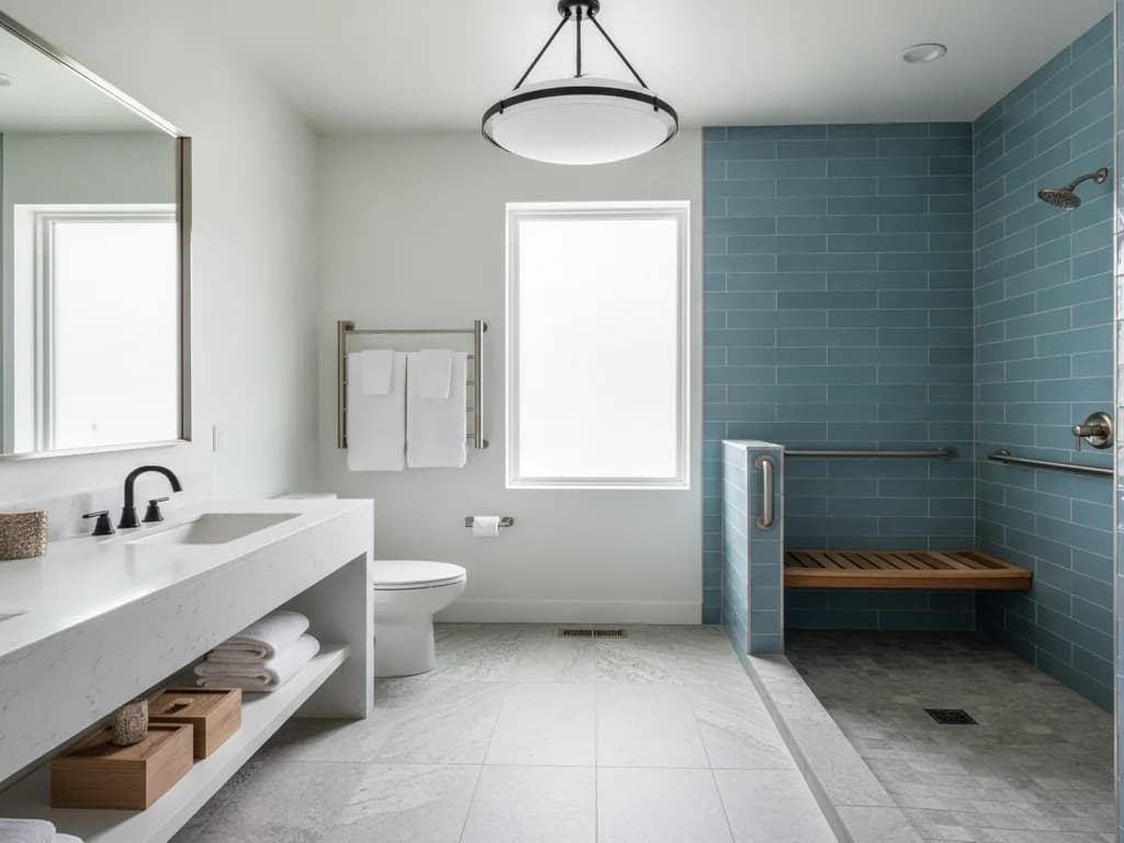
The toilet against the wall behind it is the highest-value pairing. Locating and judging the position of a toilet is a daily necessity, and a white fixture against a white wall gives almost nothing to work with. A contrasting wall behind it, or a toilet seat in a contrasting tone, resolves this immediately — the seat is the cheapest change available and can be swapped in minutes.
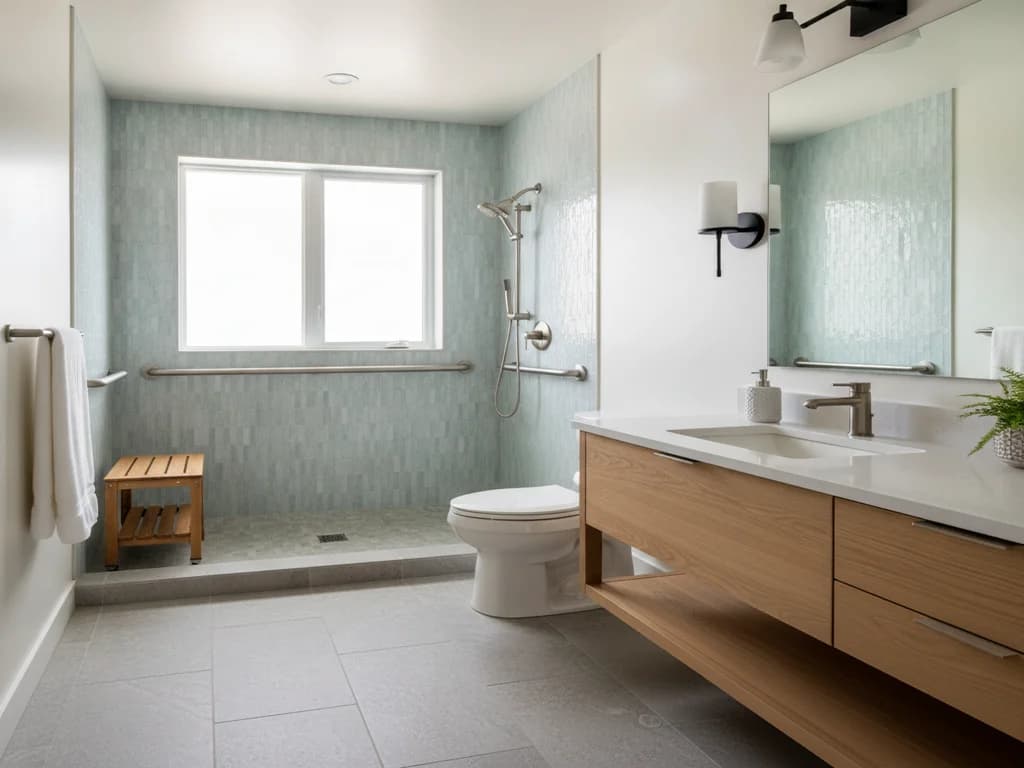
Grab bars against their wall come second. A bar that cannot be seen quickly is a bar that will not be reached for reliably. Matte black or a dark finish against light tile reads instantly, and current fixture lines make this an ordinary design choice rather than a compromise.
The floor-to-wall junction defines the boundaries of the room and helps orientation. Where floor and wall are similar in tone, a contrasting base or a distinct floor tone gives the room a readable edge.
Finally, any threshold or transition — the shower entry, a change in flooring material — benefits from being visually distinct, so a person can judge that something is changing underfoot before their weight is committed.
The five-minute version
If nothing else changes, a contrasting toilet seat and grab bars that stand out against the wall deliver a large share of the benefit. Both are inexpensive, neither requires construction, and both help people with typical vision too.
Glare is the other half
Adding light without controlling glare can reduce visibility rather than improve it. Glare occurs when light scatters off a reflective surface, and aging eyes are more susceptible to it and slower to recover from it.
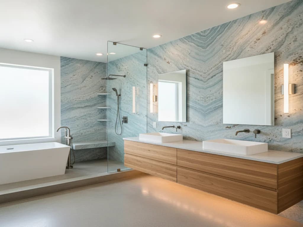
Bathrooms are full of the conditions that cause it: polished tile, large mirrors, glass enclosures, chrome fixtures, and glossy paint. A bare bulb or an undiffused fixture reflecting off a polished floor can produce a bright patch that obscures everything around it.
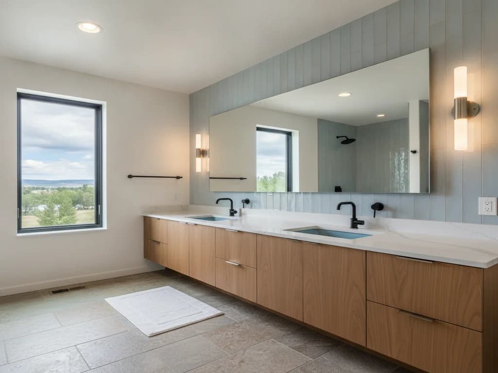
The remedies are ordinary specification choices. Matte or honed tile finishes rather than polished. Diffused fixtures rather than exposed bulbs. Several modest light sources distributed around the room rather than one bright source, which also reduces the deep shadows that hide edges.
Matte and honed surfaces have a second advantage worth noting: they generally offer better slip resistance when wet than polished equivalents, so the choice that helps visibility often helps footing as well.
This is a selection decision, not a budget line
The useful thing about designing for contrast is that it does not cost more. A dark floor tile costs the same as a pale one. A contrasting toilet seat is the same price as a matching one. Matte black grab bars cost what polished chrome costs. Wall paint is wall paint.
What it requires is deciding deliberately rather than defaulting. The all-white bathroom is a default — it photographs well, it feels clean, and it is what showrooms display. It is also, for a household where someone has reduced vision, one of the least readable rooms that can be built.
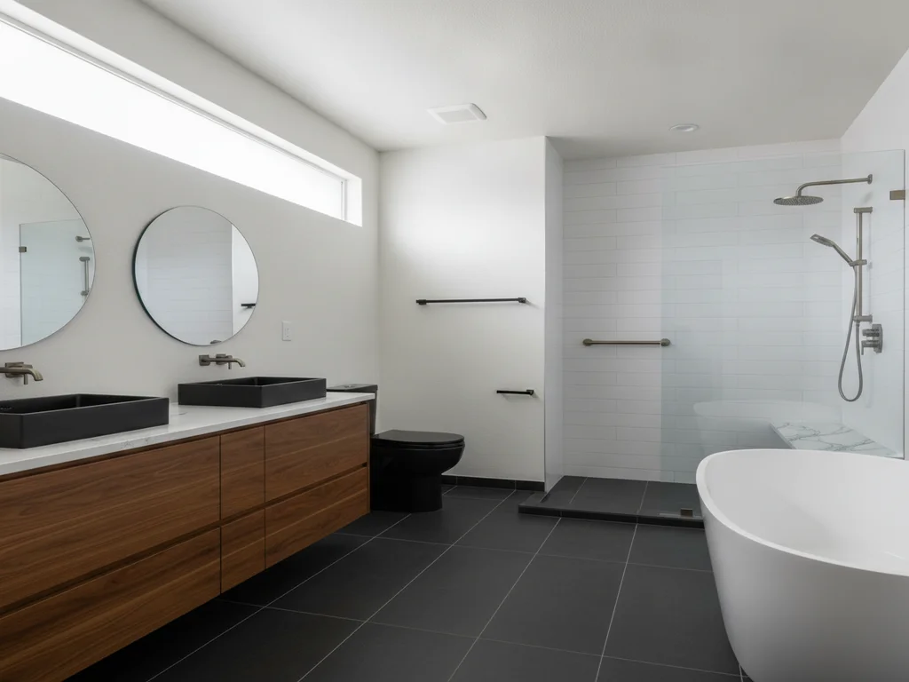
It is worth saying plainly that none of this produces a bathroom that looks institutional or unattractive. High-contrast bathrooms are a mainstream aesthetic: dark floors with light walls, black fixtures against white tile, a deliberately contrasting vanity. The design language already exists, and it happens to be functional.
Who else benefits
Designing for contrast is a good example of accessibility work that improves the room for everyone in the house.
Anyone waking at night with unadjusted eyes benefits from readable edges. So does anyone in a steamy bathroom after a shower, when a mirror fogs and light diffuses. Children judging the edge of a step benefit. Guests unfamiliar with the room benefit.
Because none of it costs extra and none of it looks clinical, contrast is among the easiest decisions to justify in any bathroom expected to serve a household for a long time — regardless of whether anyone currently has difficulty seeing.
What the process looks like
- 1
Audit the room for tonal sameness
Look at the toilet against its wall, grab bars against theirs, and the floor against the wall. Anywhere two adjacent surfaces read as the same tone is a place information is missing.
- 2
Fix the highest-value pairing first
A contrasting toilet seat is the cheapest change available and can be swapped in minutes.
- 3
Choose finishes that contrast, not just coordinate
Dark floor against light walls, dark fixtures against pale surrounds. This costs nothing extra — it is a selection decision, not a budget line.
- 4
Control glare while adding light
Specify matte or honed finishes, use diffused fixtures rather than exposed bulbs, and distribute several modest light sources instead of one bright one.
Ready to plan your Boise bathroom?
Licensed & insured · 3-year workmanship warranty
Frequently asked questions
- Why is contrast more important than brightness for low vision?
- Contrast sensitivity — the ability to distinguish an object from a similar-toned background — declines with age independently of visual acuity. Someone with a current prescription can still struggle to tell where a white toilet ends and a white wall begins. Adding light does not restore missing contrast, and on glossy surfaces it can add glare.
- What is the single cheapest change for a low vision bathroom?
- A contrasting toilet seat. Locating and judging the position of a toilet is a daily necessity, and a white seat against a white fixture against a white wall provides almost no visual information. A dark seat can be swapped in minutes for very little money and delivers a disproportionate share of the benefit.
- What colour should grab bars be?
- Whatever contrasts clearly with the wall behind them — commonly matte black or a dark finish against light tile. A bar that cannot be seen quickly will not be reached for reliably. Current fixture lines offer grab bars in finishes that read as a deliberate design choice rather than a medical fitting.
- Does a glossy tile finish cause problems?
- It can. Polished surfaces scatter light and produce glare, which aging eyes are more susceptible to and slower to recover from — so a bright patch can obscure everything around it. Matte or honed finishes reduce glare and generally offer better slip resistance when wet, so the choice helps twice.
- Does designing for contrast cost more?
- No. A dark floor tile costs what a pale one costs, a contrasting toilet seat costs what a matching one costs, and matte black grab bars cost what chrome costs. What it requires is choosing deliberately rather than defaulting to the all-white palette showrooms display.
Sources
- U.S. Access Board — ADA Accessibility Standards
- ADA.gov — U.S. Department of Justice
- AARP — Livable Communities / HomeFit
- National Kitchen & Bath Association (NKBA)
- Tile Council of North America (TCNA)
Claims and figures are drawn from the sources above and provided for general guidance; your project may vary. Photography is illustrative of design concepts. For a fixed price on your specific bathroom, request a free estimate.